
Tips for Choosing Calm Colors to Create a Peaceful Home
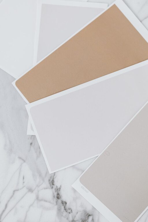
Creating a peaceful and relaxing home environment often starts with your choice of colors. Calm colors have the power to reduce stress, foster tranquility, and make your living spaces feel more welcoming. But with so many color options available, how do you choose the right ones to achieve a soothing atmosphere? This guide offers practical tips to help you select calm colors for your home, whether you’re painting, decorating, or planning a full redesign.
Why Choose Calm Colors?
Colors influence our mood and energy levels more than many realize. Bright or intense colors like reds and oranges tend to be stimulating, while muted and soft colors can help bring a sense of calmness and balance. Using calm colors in your home can:
– Lower anxiety and stress
– Promote restful sleep
– Encourage relaxation and mindfulness
– Create a harmonious and inviting space
Understanding Calm Colors
Calm colors typically include shades that are soft, muted, and not too saturated. These colors often come from cool or neutral palettes, and they include:
– Light blues and soft greens: These colors are associated with nature and water, evoking feelings of serenity.
– Pale grays and taupes: Neutral tones that provide a gentle backdrop without overwhelming the senses.
– Soft pastels: Light pinks, lavenders, and peaches can add a subtle warmth while maintaining calmness.
– Warm neutrals: Beige, cream, and light browns offer cozy, calming effects when used properly.
How to Choose Calm Colors for Your Home
1. Consider the Room’s Purpose
Each room in your home has a different role, which should influence your color selection.
– Bedrooms: Opt for soft blues, muted greens, or gentle lavenders to encourage rest and relaxation.
– Living rooms: Warm neutrals or soft grays create a versatile, calming space for conversation and unwinding.
– Bathrooms: Light blues and seafoam greens can invoke a fresh, tranquil feeling.
– Kitchens: Gentle pastels or soft neutrals work well to maintain a cheerful but soothing environment.
2. Look for Natural Inspirations
Nature is a great source of calm color inspiration. Consider colors you find in natural settings like:
– The pale blue of the sky
– The soft green of moss or leaves
– Earthy browns and beiges of soil and sand
Bringing these hues indoors can help you feel more connected to the outdoors, enhancing relaxation.
3. Test Sample Colors in Your Space
Colors can look different depending on lighting, wall texture, and surrounding objects. Always test paint samples in the room where you plan to use them.
– Paint swatches on different walls and observe them at various times of day.
– Use sample boards or large color chips to compare against your furniture and flooring.
– Consider how artificial light influences the color during evenings.
4. Balance Color with Neutrals and Accents
While calm colors mostly involve soft tones, mixing them with neutral colors and subtle accents helps create depth and interest.
– Use a soft neutral like off-white or pale gray as a base color.
– Add calm accent colors through cushions, artwork, rugs, or curtains.
– Avoid too many competing colors to keep the atmosphere peaceful.
5. Pay Attention to Color Temperature
Colors have a warm or cool undertone, which affects the mood of a room.
– Cool tones: Blue, green, and lavender are calming and refreshing. Great for bedrooms and bathrooms.
– Warm tones: Beige, soft peach, and light taupe create cozy, comforting spaces, ideal for living rooms and dining areas.
Choose the temperature that fits the vibe you want for each room.
6. Choose Matte or Soft-Finish Paints
Finish matters as much as color. Matte or eggshell finishes reflect less light and help create a soft, calming environment. Glossy finishes can be too reflective and intense for calm spaces.
7. Combine Textures to Enhance Calmness
Introducing different textures adds visual interest without overwhelming your calm color palette.
– Soft fabrics like linen and velvet
– Natural materials like wood, stone, or woven baskets
– Smooth surfaces with subtle patterns
Textures provide warmth and comfort, complementing calming colors perfectly.
Common Mistakes to Avoid
– Choosing colors that are too dark: While deep colors can be cozy, very dark shades may feel heavy or gloomy in large amounts.
– Ignoring lighting conditions: Not accounting for natural and artificial light can result in colors looking harsh or dull.
– Overusing bright accents: Even small pops of intense colors can disrupt the calm atmosphere. Use them sparingly.
– Forgetting personal preference: While trends are helpful, your comfort with the color is most important.
Final Thoughts
Choosing calm colors for your home is a wonderful way to create a sanctuary that supports relaxation and well-being. Start by understanding the mood you want to create and selecting colors inspired by nature, texture, and light. Remember to test colors in your space and balance your palette to maintain harmony. With thoughtful choices, your home can become a peaceful retreat filled with soothing, calm colors.
Would you like to share your favorite calm color combination or tips? Leave a comment below!
Related Post
Quick Ideas to Brighten a Dark Room and Create a Welcoming Space
Discover simple and effective ways to brighten a dark room with lighting, color, and décor [...]